Overuse and Misuse of Spacers in SwiftUI Code
When it comes to writing good user interface code, and code in general, it’s not exactly groundbreaking to claim that in any given situation, we should strive to use the right tool for the right job. When working with tools and frameworks that are designed to seem simple on the surface and easy to get started with, it can be more challenging to discern what is easy to reach for from what is right. One of the greatest complexities of good API design, in my opinion, is getting progressive disclosure right, while also not obfuscating best practices.
Progressive Disclosure
Apple’s modern API design is heavily influenced by the concept of progressive disclosure. While some frameworks that have to preserve their existing conventions and philosophy, like AppKit and UIKit, may not make it evident to the fullest extent, many Swift standard library and SwiftUI APIs have been guided by it from the beginning.
Progressive disclosure as a concept was explicitly introduced and explained by Apple in this WWDC22 talk.
Progressive disclosure <...> is designing APIs so that the complexity of the call site grows with the complexity of the use case. An ideal API is both simple and approachable but also be able to accommodate powerful use cases.
SwiftUI takes this definition to heart. While you can see progressive disclosure as the guiding principle of many of its APIs, the approach to describing layout, and particularly flexible layouts, is what I’d like to zoom in on in this post.
Flexible Layouts
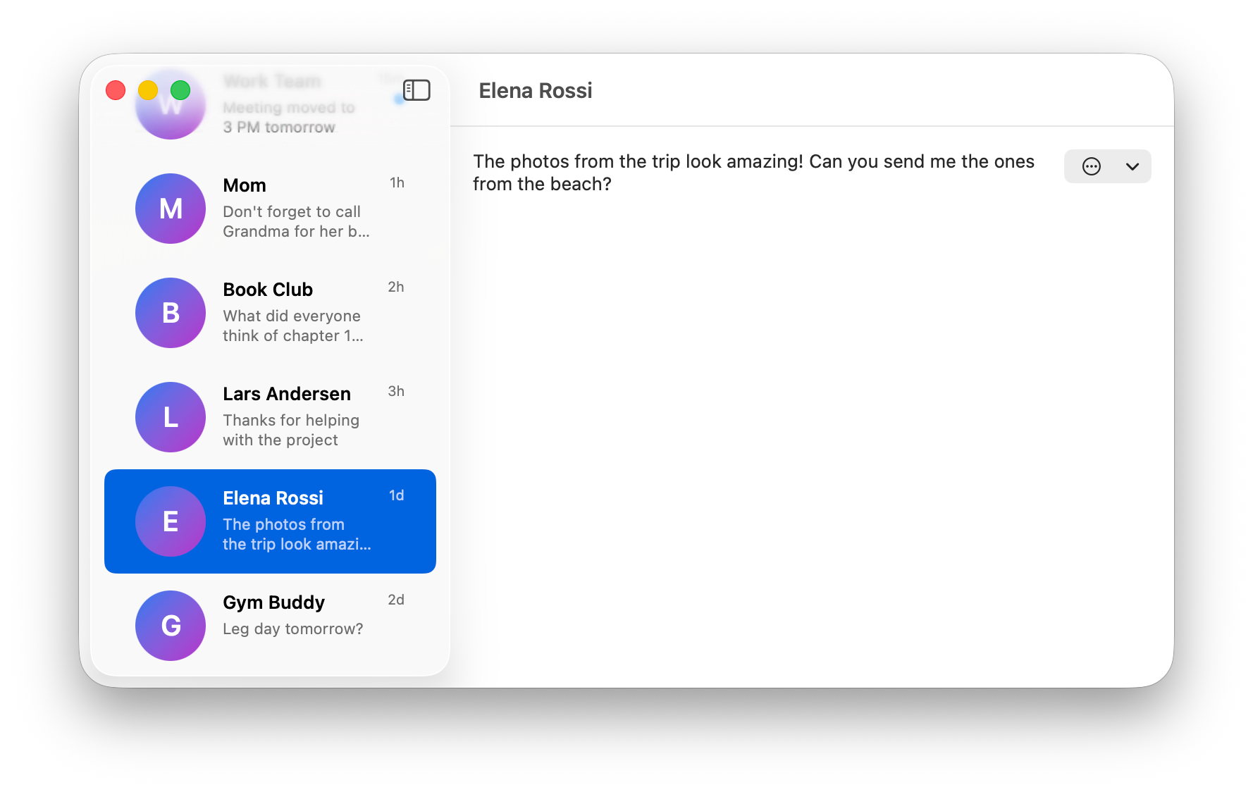
Let’s start with a simple example of a layout where flexibility plays a key role. Here’s the list of messages in our imaginary messaging app.
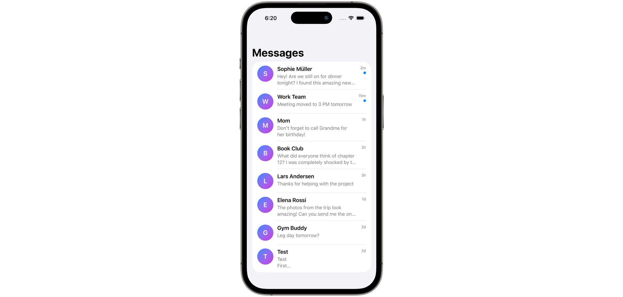
If you start with iOS as your default platform, it can be a nice simplifying assumption that this layout is quite static – after all, there is no resizing, moving pieces, and the size is (kind of) statically known. We can achieve a very nice result by just taking the simplest path and describing the layout in a very literal way. SwiftUI makes it easy and doesn’t force you to think about the complexity until you’re ready. There is nothing inherently wrong with that, especially if you’re learning or prototyping something simple! So, our code could look like this:
HStack(spacing: 12) {
    AvatarView()

    VStack(alignment: .leading, spacing: 4) {
        Text(conversation.name)
            .font(.headline)

        Text(conversation.lastMessage)
            .font(.subheadline)
    }

    Spacer()

    if conversation.isUnread {
        UnreadIndicator()
    }
}
The complexity does come, eventually. You quickly realize that not only do iPhone screens come in many different sizes, our sidebar will actually become a flexible resizable container on iPad and Mac. This will lead us to the first problem.
Problem 1: Limited Space
It’s not that hard to see that using a Spacer as a stand-in for a flexible layout is sloppy at best. As your view shrinks horizontally and real estate becomes a premium, you'll notice the first problem: the text will start shrinking and truncating way too early.
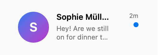
By visualizing the view hierarchy, we can see that the Spacer will actually double the minimum spacing between your text and the trailing badge.
It should come as no surprise: a Spacer is a view, after all, so it participates in layout like any other view. Since our HStack has some built-in spacing between views, and since the Spacer is one of those views, the minimum visible space between the title and the unread indicator is actually double the value we declared. At this point, I find that a great question to ask myself is the following:
Does my layout really need some added flexible space, or am I misusing a Spacer where I should’ve actually made another view flexible?As a view, a Spacer is flexible along its dominant axis. This is not true for other views, like Text or Image, by default.
What I actually want in cases like this is to be precise about which views you want to grow and shrink as the container grows larger or shrinks in size. We’d want to omit the spacer, and make the VStack’s width flexible using the frame modifier with the desired alignment.
HStack(spacing: 12) {
    AvatarView()

    VStack(alignment: .leading, spacing: 4) {
        Text(conversation.name)
            .font(.headline)

        Text(conversation.lastMessage)
            .font(.subheadline)
    }
    .frame(maxWidth: .infinity, alignment: .leading) // A simple modifier instead of a separate view.

    if conversation.isUnread {
        UnreadIndicator()
    }
}
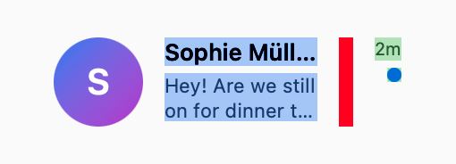
Here’s what that would look like:
Problem 2: Text Selection & Editing
Let’s consider the following view representing the detail of the conversation in our imaginary messaging app. We’ll show the latest message as a very simple text view with a set of actions on the right.
The caveat here is that I’d like to create a great text selection (and editing) experience for devices with a mouse pointer, such as a Mac. Something like this would work at first glance:
VStack(alignment: .leading, spacing: 16) {
    HStack(alignment: .top) {
        Text(conversation.lastMessage)
            .textSelection(.enabled)

        Spacer()

        ConversationActions()
    }
    .padding()

    Spacer()
}
But let’s consider the case where the conversation contains a message with a lot of explicit newline characters. Perhaps someone sent us a code snippet?

If we try selecting this, we will have to be very precise about it. You may also notice that the selection of multiple lines doesn’t extend as far to the right as it could (and maybe should), which would be more in line with the experience you’d see in an app like TextEdit.
VStack(alignment: .leading, spacing: 16) {
    HStack(alignment: .top) {
        TextField(…)
            .textSelection(.enabled)
            .frame(maxWidth: .infinity, alignment: .leading)

        ConversationActions()
    }
    .padding()
    .frame(maxHeight: .infinity, alignment: .topLeading)
}
Of course, this is a somewhat contrived example, but the general point is a fairly important one.
While imprecisions in how your layouts are expressed may seem like implementation details at first, in some cases they may become exposed to the user by the framework, leading to an inconsistent and subpar user experience.
Text selection is a great example of this: multiline selections will always expose the actual bounds of your text view to the user. Other examples include various backgrounds and effects (including a glass effect), context menu shapes on iOS and visionOS, and contextual menus on macOS.
Problem 3: Layout Performance
The next point would be very superficial in the simple example like our tiny messaging app. However, as your application scales, and you become more aware of the limitations of your control over performance, or start dealing with very dynamic layouts and large conversations, considerations like performance will become exceedingly important.
Consider the following scenario. Your messaging app has evolved to be an enterprise solution for business communication, and users often exchange very large multiline messages. Your conversations are also highly dynamic and users can edit existing messages, making text bold and italic, at any point.
At this point, we should remember that multiline text measurement is expensive, especially when compared to the measurement of simpler shapes or controls like buttons. And, by default, SwiftUI will size our text to fit. This means that every time a user performs an edit, our text will be re-measured. This measurement, expensive enough by itself, will cause the view to resize (because we’ve told SwiftUI we wanted it to size it to fit). After the text view is resized, the Spacer will need to be laid out as well, alongside with other views in the layout.
Of course, you don’t have to worry about this when building a very simple application. But, if we had expressed the intention for our text view to fill available space along the horizontal axis, the framework could have had the opportunity to avoid a bulk of the redundant layout work. As the text is updated, as long as the new width does not exceed the current width it occupies, we could elide the work to measure or re-layout any other views if they have not changed.
Conclusion
Spacers are not some great evil or a mistake of SwiftUI API design. They are a great tool in your toolkit, especially when constructing more complex masks or controlling explicit alignment during animations and transitions. But, sinceSpacers are extremely easy to reach for, they are often misunderstood and overused.
As you progress on your SwiftUI journey, try to consider the toolkit available to you and always strive to describe the layout in the most accurate way. By doing so, you’ll notice you’re working together with the framework instead of against it, and will be able to add more advanced functionality to your UI with minimal code changes.